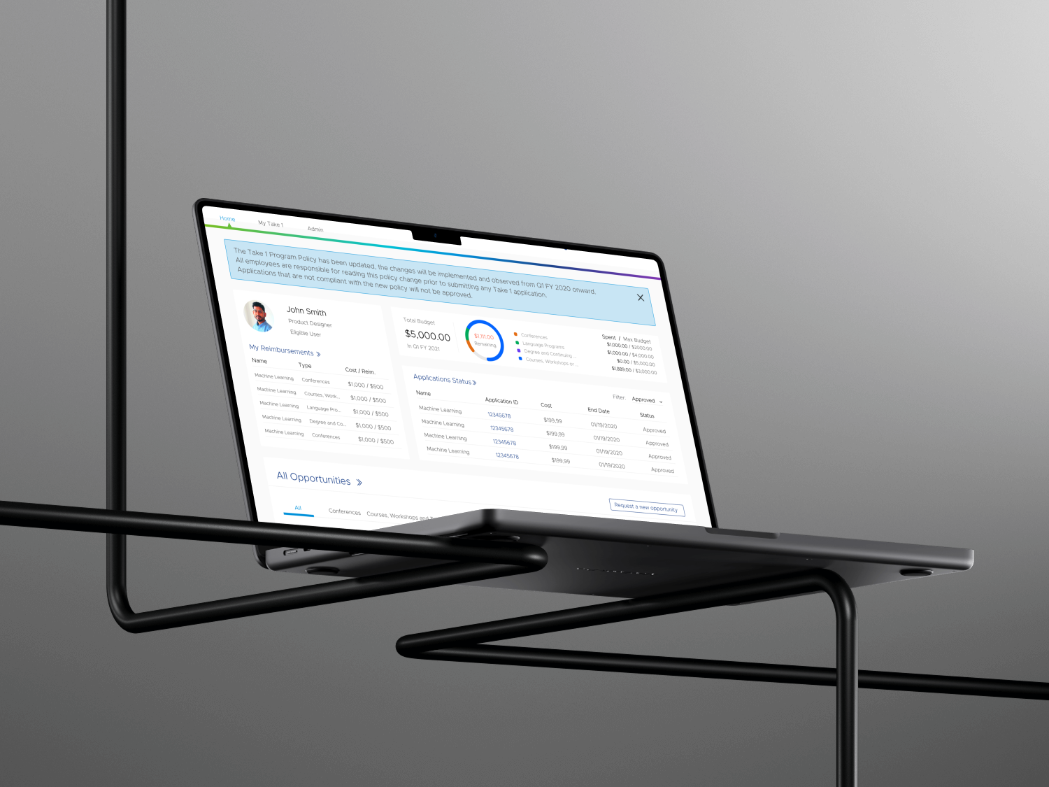
VMware Take One provides employees with at least one year’s service up to $5,000 annually for professional development opportunities so that Employees could use Take 1 to prepare themselves for their future career path within the VMware. I led the end to end design on this project. I worked very closely with one product owner, one product manager and six engineers.
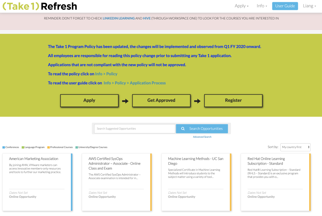
1. Understanding business requirements
I started my design process with understanding the business requirements. I had meeting with product owner and product manager to have an overview of the whole project. Here are the key findings from meeting:
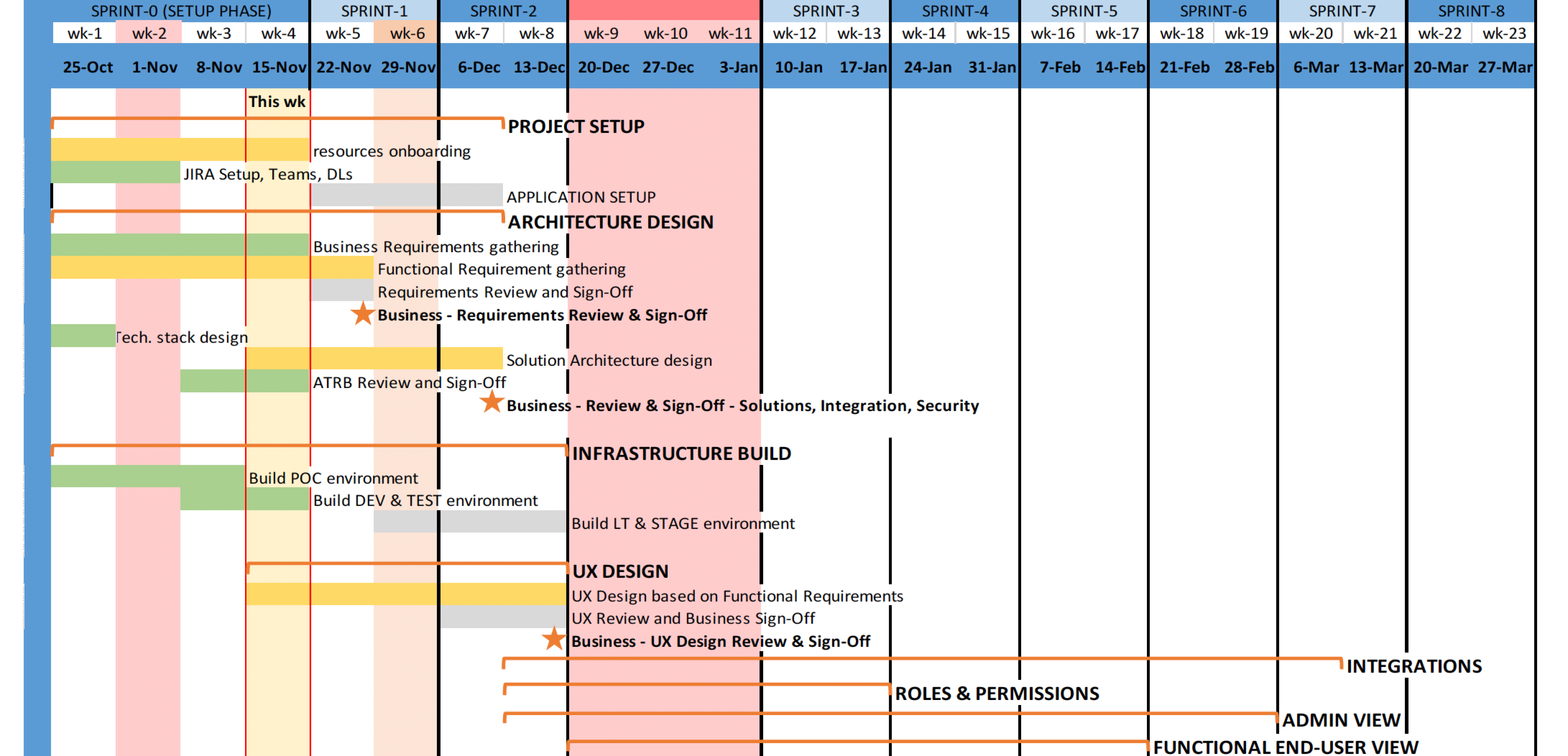
2. Convincing stakeholders to let me conduct user research
There were lot of doubts in my mind had not been solved and stakeholders could not help me clarify these questions. The biggest challenge was that I had not idea about what the user problems were and I only have 3 months to finish the first version. The stakeholder's initial idea was simply reskinning the entire website. However, without know the real problems are, reskining is not a great solution. Inn order to better understand and solve the problems for users. Therefore, I convinced the stakeholders to let me conduct the user research to find out the real user problems were.
Here were some of my assumptions before I conduct the user research:
1. Finding out the main user problems
To ensure our solution was effective, we needed to focus on specific user groups rather than trying to cater to everyone. This approach allowed us to identify and prioritize the most critical issues faced by employees and managers, who make up the majority of our users. We focused on addressing the challenges faced by employees and managers, as they represent the majority of our user base. This targeted approach allowed us to concentrate on the most pressing issues and streamline our efforts effectively. I chose to conduct the three focus groups because of the time issue. I worked with product owner to recruit total 15 participants. There were 10 employees and 5 managers. I also invited the stakeholders to join in the group to listen closely about users' problems.
Here are the three methods I used in the focus groups:

2. Sharing the findings with team
Through the focus group. I collected all of findings. I worked with stakeholders and I prioritized the task and created personas for employees and managers
Here are key user problems:

3. Making an new agreement on changing plan with stakeholders
I did the report to entire team and shared the findings with them. After discussion, we had made an agreement and revised our plan:
4. Creating metrics to measure successes
Here are the factors that help me to measure the success:
1. Searching references
In order to redesign the entire website, I started searching some references to get more ideas. The purpose was to learn about the great functionalities and gathering inspiration from other learning platform.
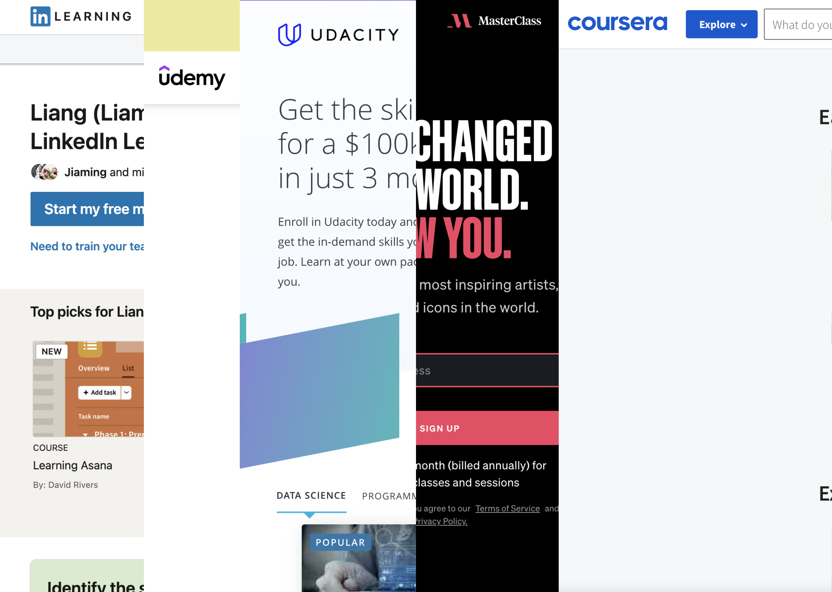
2. Brainstorming the ideas with stakeholders
I loved this functionality on Udemy. I could easily find all of my course history and check current course progress.
This is one of the quotes I collected from the findings. In order to provide better experience for our users, we started to brainstorming our ideas on the functionalities. and I also invited the lead engineer in to the meeting to help us to decide which functionalities were feasible.
Here are the new functionalities we added:
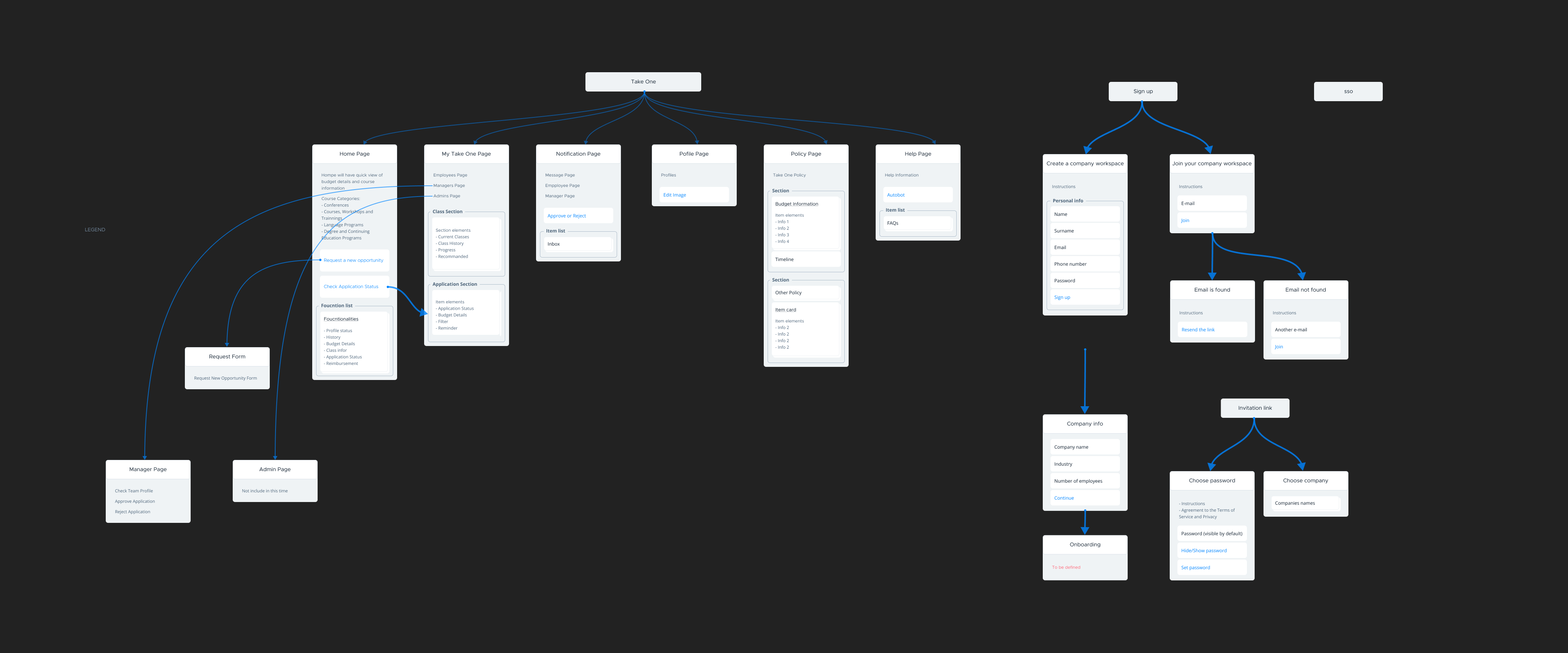
3. Creating user flowcharts
Up until now I had a vague idea of how the application will function. Mapping the basic flow of the app forced me to figure each step on the path the users will take throughout the solution. I first sketched it on paper and then digitally rendered it.
4. Sketching the layout
This was the first step to help me outline the app and visually imagine it.
5. Building wireframes
This visual guide represents the skeletal framework of the app. It helped me arrange the interface elements while I focused on the functionality rather than what it looks like. Moreover, the simplicity of wireframes allows me to quickly test ideas without diving into the details.
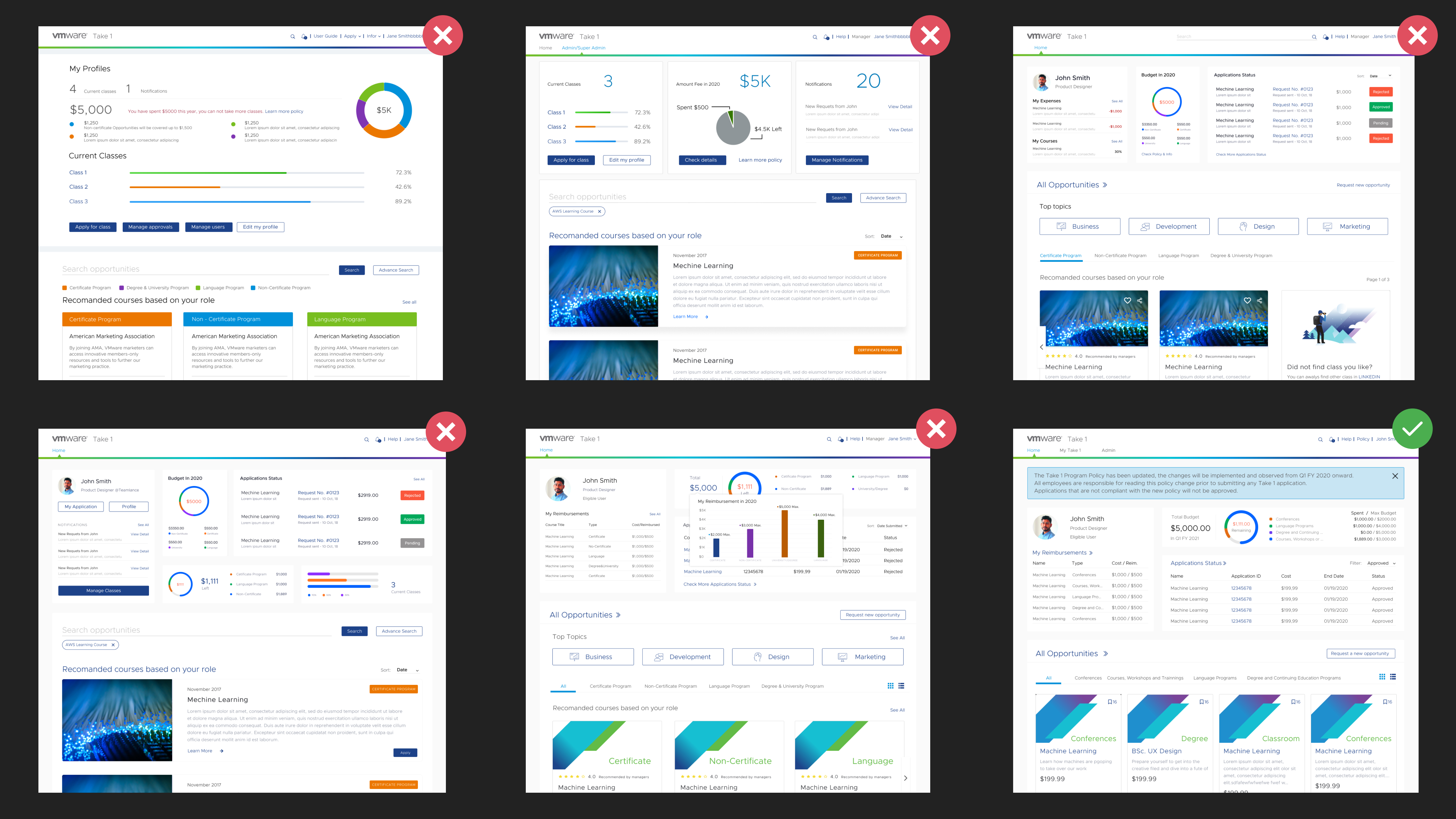
6. Iterating the designs
Next I explored different design possibilities: From each repetition of the design I learn something that I can use for the next iteration.
7. Building the prototype for usability testing
I created prototype in Figma for testing purpose.
8. Conducting usability testing
I intended to invite all fifteen participants who joined the focus group earlier back. However, we were on a very tight timeline; I worked with the product owner and chose 5 of them for the 30 mins usability test
Here are the results:
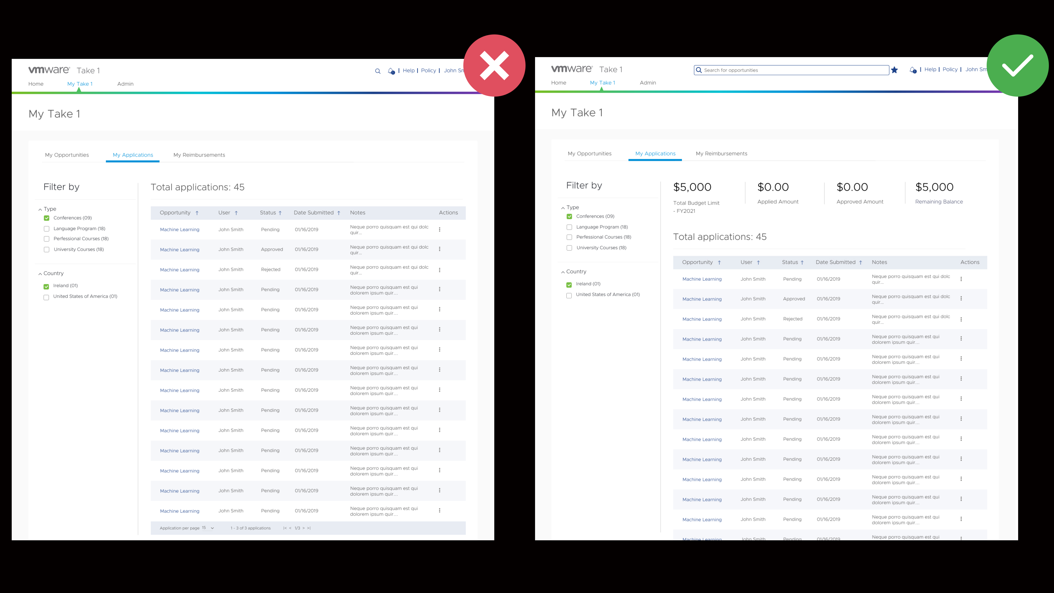
9. Revising the design based on feedback
According to the feedback, I started to do some revises before I deliver the design to engineers
I forgot how much budget I have when I at application pages. I wish there is a quick view to remind me
1. Providing Q&A to engineering team
Usually I will create detailed design guideline to engineering team. However, this time I did not have enough time. Therefore, I set up the daily meeting with the engineering team to quickly follow up with them and provide the information if needed.
2. Following up the result with stakeholders
After the product launched, I actively followed up with product owner to see the results and next steps
1. What did I learn
Designing this website has been a challenging and rewarding journey.
2. What are the next steps
